
Website Renewal - Background and Design
Table of Contents
- Top
- Background
- Articles and created items are scattered
- Why not use a platform?
- Original Design
- Ground Design
- Color Scheme
- Font
- Article Display
- Article Screen
- Header and Footer
- Responsive Design
- Animation
- Multilingual Support
- Content Translation
- URL Options
- Portability
- High Portability
- Ease of Text Proofreading
- Ease of Management
- Extensibility
- Summary
I have renewed the esplo.net website.
Like the Shikinen Sengu, I periodically transplant it, but this time the theme is "original design", "multilingual support", and "portability".
I will leave the technical details and implementation for the next article, and first, I will look at the background and details of these themes.
Background
Generally, renewals are often done based on the developer's mood, and this time was no exception as it was implemented because I felt like it. However, there were some issues I wanted to resolve, so I'll summarize the challenges that existed before the migration.
Articles and created items are scattered
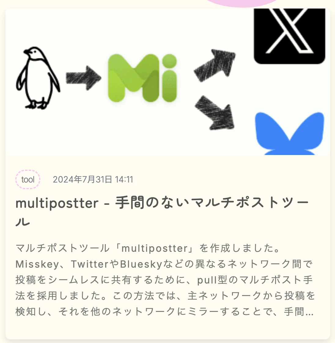
Blog posts were placed on blog.esplo.net, but after trying Zenn, note, and dev.to, they ended up scattered across various places on the internet. The Qiita I used in the past also remains. Also, created items were placed on the Works page, but because they were separated from blog posts, they were in a place that was difficult to access.
In this renewal, I have consolidated articles in one place to improve visibility and manage them collectively so that I don't forget what I've written[1].
Why not use a platform?
Firstly, there is an intention to write articles in Markdown and manage them myself. This is because I want to use excellent local editors like VS Code and make batch changes.
It's also because tools like textlint can be used for Japanese proofreading, and there are significant benefits to having the original manuscript in markdown for multilingual support, which I'll mention later. It also has high portability, making it easy to respond to changes like this one.
Among the currently mainstream blog platforms, there are not many that allow you to manage articles locally.
Secondly, there was a point of wanting to try multilingual support.
WordPress blog sites often have a language switching function within the page. Normal blog platforms usually only support one language, and if necessary, you need to separate languages by account. You may have wondered about achieving more convenient management and switching.
Thirdly, there's the issue of flexibility.
For example, Zenn has good features and design, but basically, only technical articles can be posted[2]. Also, features like adding captions to images and grouping articles in series are available on some platforms but not on others, creating a situation where you can't have it all.
Because of these concerns, I decided to build from the blog system itself.
Original Design
This is the first theme. When considering this renewal, what troubled me was the site design. When I thought about creating it myself without using a template, I had to consider everything from typography to layout. So, I decided to build it up while recalling the knowledge from books I've read so far.
By the way, the old site was exactly the same as the Notepadium theme screen of Hugo. It's a simple and easy-to-read theme, suitable for technical blogs. However, it felt a bit too simple and I wanted to change the impression.

Old site screen - Top

Old site screen - Article detail
Ground Design
First, I considered what kind of impression I wanted to give.
Since the main content is a technical blog, I decided to add elements that don't look like a technical blog as an accent, going against the grain. Looking at several technical blogs, I thought the opposite would be "bright", "cute", and "delicious"[3]. Since these are often seen on food introduction sites, I thought adding candy-like elements as an accent could change the impression. This also addresses the issue of reducing simplicity.
On the other hand, since it's a text-based blog site, it's necessary to maintain readability. Therefore, it's required to maintain a simple layout and sufficient contrast between the background and text while changing the impression. Keeping these in mind, I decided on individual elements.
Color Scheme
To give a candy-like impression, I decided to use a cream color (#FFFCF0) like sponge cake for the background, and a pink color (#FFC7ED) like strawberry sauce for the header.
I leaned towards pale tones with high brightness and low saturation for the colors used, adding brightness and cuteness. As an accent color, I used blue (#466DE2), which is complementary to the base color, making it stand out with a higher saturation. Also, I limited the colors used to just three to increase simplicity[4].

Color Palette
For usage, the base color is used for the background, the main color for the header and some borders, and the accent color for parts where I want to guide the eye, like "Read More" buttons. The contrast ratio between the base color and the main text color is 10, which is good. Even for the light text used for supplementary elements like dates, it's 4.7, meeting the minimum standard[5].
Font
Special fonts are useful for changing impressions, but they can become difficult to read when used in areas with a lot of text. Therefore, I used the default font for areas with a lot of text, such as the main body of blog posts. The browser's standard fonts are useful.
I applied ZEN Maru Gothic to areas with less text where I want to guide the eye, such as headers and footers. It's a rounded, cute, and easy-to-read font that helps soften the impression.
Article Display
I made the thumbnail display of works and blog posts card-like. Using lines for separation was too strong, but not using them made it unclear, so I took a middle ground and made them appear to float three-dimensionally. Actually, I'm just adding shadows, but it's interesting to feel the power of contrast where the unshadowed parts appear to float.
I wanted to distinguish between works and articles on the home screen, so as shown in the figure below, they look different, but the content is the same. The title part, which I want to draw the most attention to, is dark black and bold, the next important summary is a bit lighter, and tags and dates are light. I've placed the main color lightly as an accent in the tag enclosure. Also, I've rounded the edges because sharp corners can be dangerous.
Work Card

Article Card
Article Screen
This screen you're looking at now also has the same header information display as the thumbnail card.
For the main text, I refer to the easy-to-read screen of Zenn. In terms of functionality, I've adopted a Zenn-like main text display with a sticky table of contents[6], like Zenn. This is because I'm using Zenn's library to convert markdown to HTML.
I've included next and previous article links as they're common. I'm using the thumbnail card, but it's big, so I'm wondering if I should remove the image and summary.
Header and Footer
For now, there's not much information to place, so I'm using the main color as a solid fill to utilize it as a design element.
For the content, I've placed elements that seem to have a need for direct access, such as the language switch in the upper right and SNS links in the lower right. I use many icons and reduce text to maintain simplicity.
Responsive Design
I made it to fit smartphone screens. Almost everything is made with flex or grid, so it's unlikely to look strange when the screen size changes. The table of contents and horizontally long elements are branched by screen size.
By the way, I've left the width of the main text unfixed and free. Many article sites fix it, considering that it becomes difficult to read when it's too wide horizontally, and it's easier to design. On the other hand, there's also the inconvenience of articles becoming vertically long even when expanding the screen on a large display. This time, based on the assumption that it might be surprisingly readable even when wide, I left the width free.
Animation
Currently, it's used for the part where the source drips down in the header. I'm hardly using it, but I'm thinking about how to utilize it appropriately.
Multilingual Support
This is the second theme. The old site was only available in Japanese, but this time all elements support multiple languages.
Content Translation
Considering the user base, I limited the supported languages to Japanese and English only.
There are several ways to achieve multilingual support. The method of applying Google Translate to the entire page is widely used on personal sites and is easy. On the other hand, with the recent progress of LLMs, high-quality translations can be done cheaply.
Therefore, this time I took the method of passing the entire Markdown file of the manuscript written in Japanese to the Perplexity API (llama-3.1-sonar-large-128k-online) for translation into English. The resulting English version Markdown file is displayed in the same way as the Japanese version to achieve multilingual support.
However, the translation quality is not stable, and sometimes the markdown syntax is broken because instructions are not followed, it's summarized arbitrarily, or the translation is cut off in the middle. It might be possible to solve this by devising prompts, but for now, I'm just re-submitting the ones that catch my eye, believing that new models will come out. By the way, these problems were not found with GPT-4o. Amazing.
URL Options
There are also various options for how to handle language display information (locale).
There are various options like subdomains, paths, query parameters, cookies, etc., but this time I decided to include it in the path and have the browser retain the state. This is because the content can be completely separated and switching is relatively easy.
When opening the canonical URL, it automatically determines the locale and redirects while allowing switching in the header.
Portability
Works articles and blog posts are written in markdown files. Those who have used Hugo will find this easy to understand. This provides the following advantages:
High Portability
Even if you want to take it to another site, you can just copy and paste the markdown content. Also, because it's a standardized notation, it's easy to convert to other formats.
If you've used a blog platform before, many of you may have had trouble migrating images. For small sites, if you deliver all images in articles via Cloudinary, you can complete it with just copy and paste.
Ease of Text Proofreading
Because it's almost plain text and widely known notation, you can use various linters. Starting with textlint, you can easily borrow the power of tools that are helpful when writing articles.
Furthermore, as seen in multilingual support, being able to use the output from LLMs as is is also a strength. If you tell it to "return in markdown format!", it usually spits out correct markdown, so you can deploy just by copying and pasting the results of translation or text proofreading.
Ease of Management
It's also easy to replace multiple articles at once, or apply results from LLMs and revert part of it if you don't like it. After all, you can use Markdown, Git, and VS Code, so you can process it with the same feeling as handling normal source code. For engineers, there's no learning cost at all to use powerful tools, so you can manage without much effort by standing on the shoulders of titans.
Extensibility
The expressive power of Markdown itself is inferior to general blog platforms, but it's not a problem for writing normal articles. Also, if you really get stuck somewhere, you can tweak the parser to somehow manage. There are various markdown parsers and plugins in the world, so you can use whichever you like[7].
If you overdo it, you'll lose portability, so you can't abuse it, but it's fun to have an Escape Hatch and be able to do various things.
Summary
So far, we've looked at the background and themes related to the site renewal. In the next article, I plan to touch on the details of functions and implementation, and future challenges.
Some are still being migrated ↩︎
As an exception, on Hatena Blog, there are official themes like Sushi Yuki and Popcorn by Katano Tomoko, so you can see technical blogs with cute designs ↩︎
It's difficult to use many, and I'm not sure if the achromatic text should also be included in the palette ↩︎
According to w3.org, the minimum is 4.5, and 7 or more is considered excellent. https://www.w3.org/WAI/WCAG22/quickref/?versions=2.1#contrast-minimum ↩︎
Zenn's table of contents is more beautiful, but it seemed difficult to imitate, so I gave up ↩︎
By the way, Zenn's library uses markdown-it. ↩︎